Moodboards
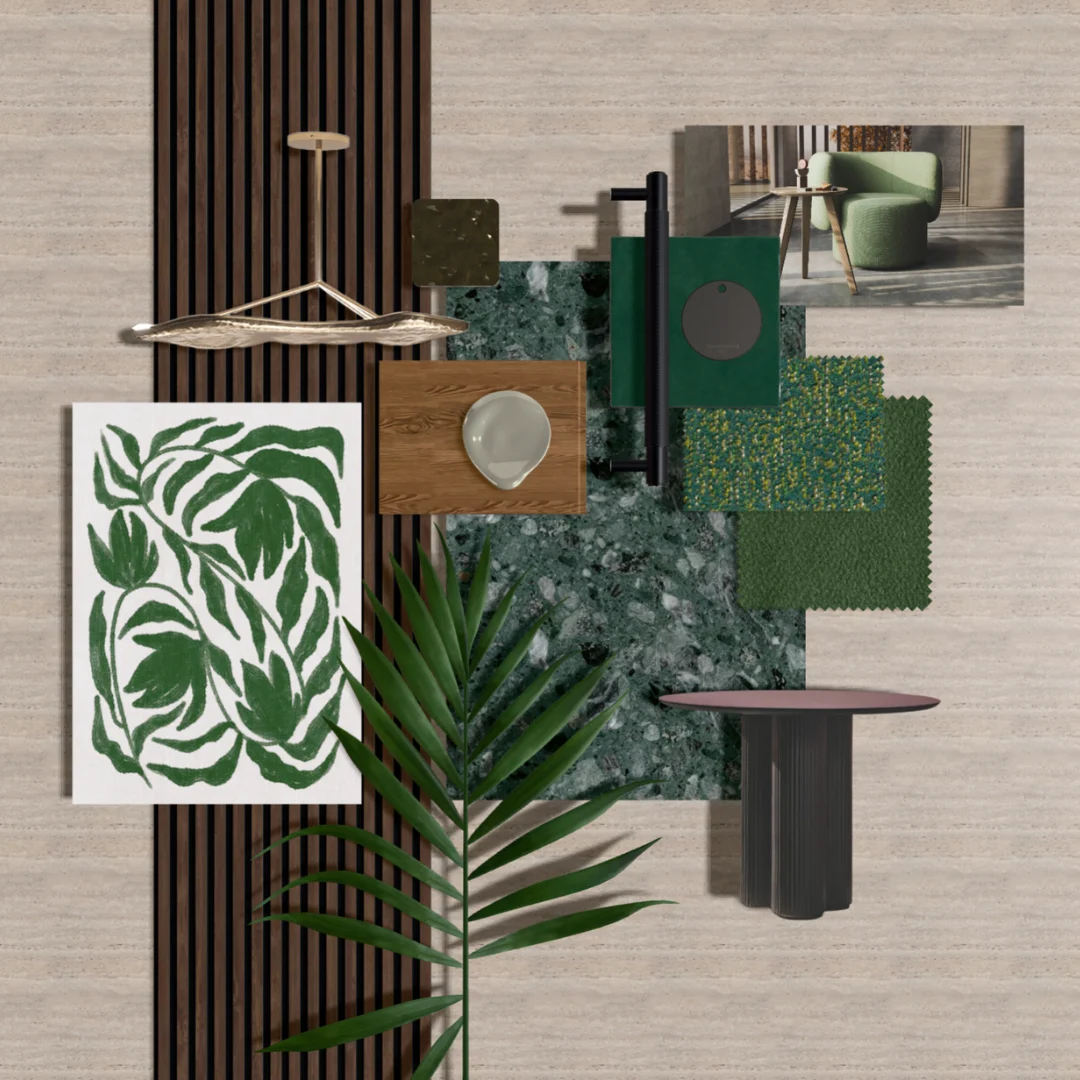
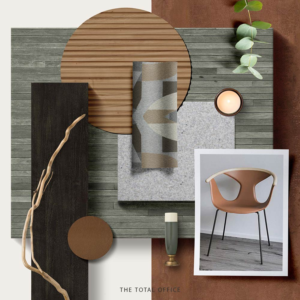
Verdant Harmony
A curated blend of nature-inspired design and tactile comfort: AW Bolete Table – Organic elegance meets functionality. LUUM Unbounded & Super Shearling – Textural depth with a soft, inviting touch. Ora B&T – Timeless craftsmanship with a modern edge
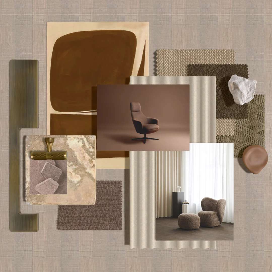
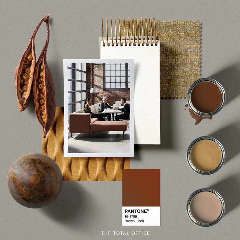
Mocha Mousse
2025 New Colour of the Year Mocha Mousse Featured Products: Calma Lounge - Andreu World Rationale - LUUM Archisonic Acoustics - Impact Acoustic Monotex - LUUM Big Big Chair - Norr 11
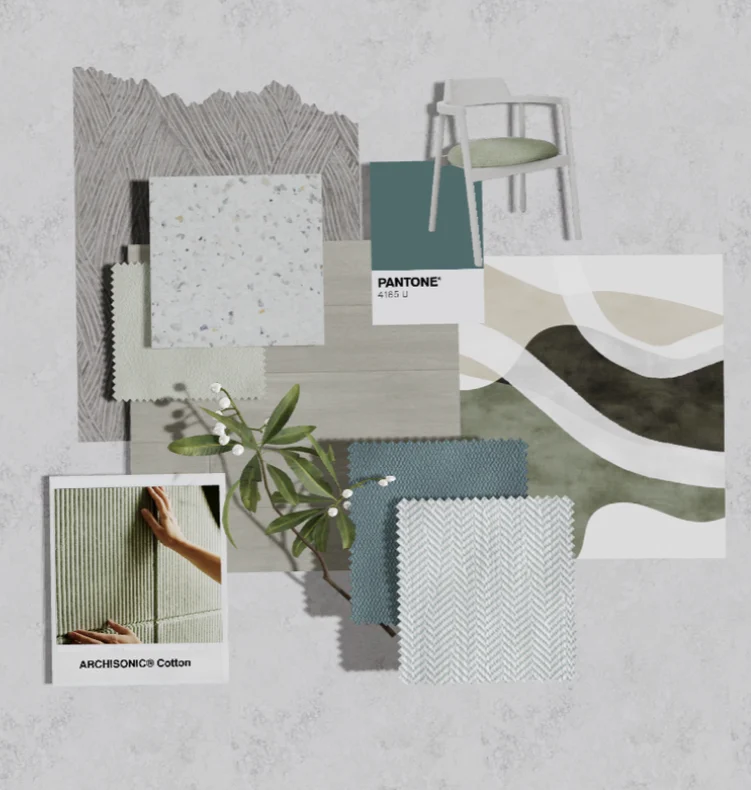
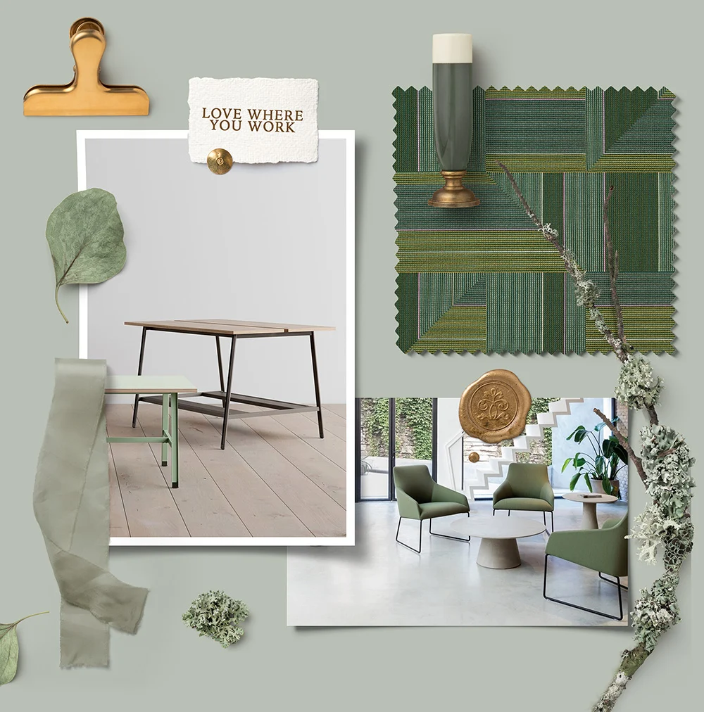
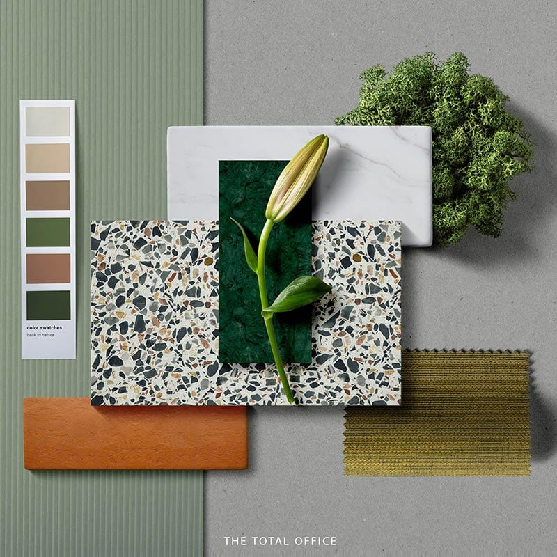
Green Forest
Featured Products: ARCHISONIC® Cotton - Impact Acoustic Herringbone Hybrid & Demi Boucle- LUUM Ocean- Smile Plastics Alek Chair- B&T
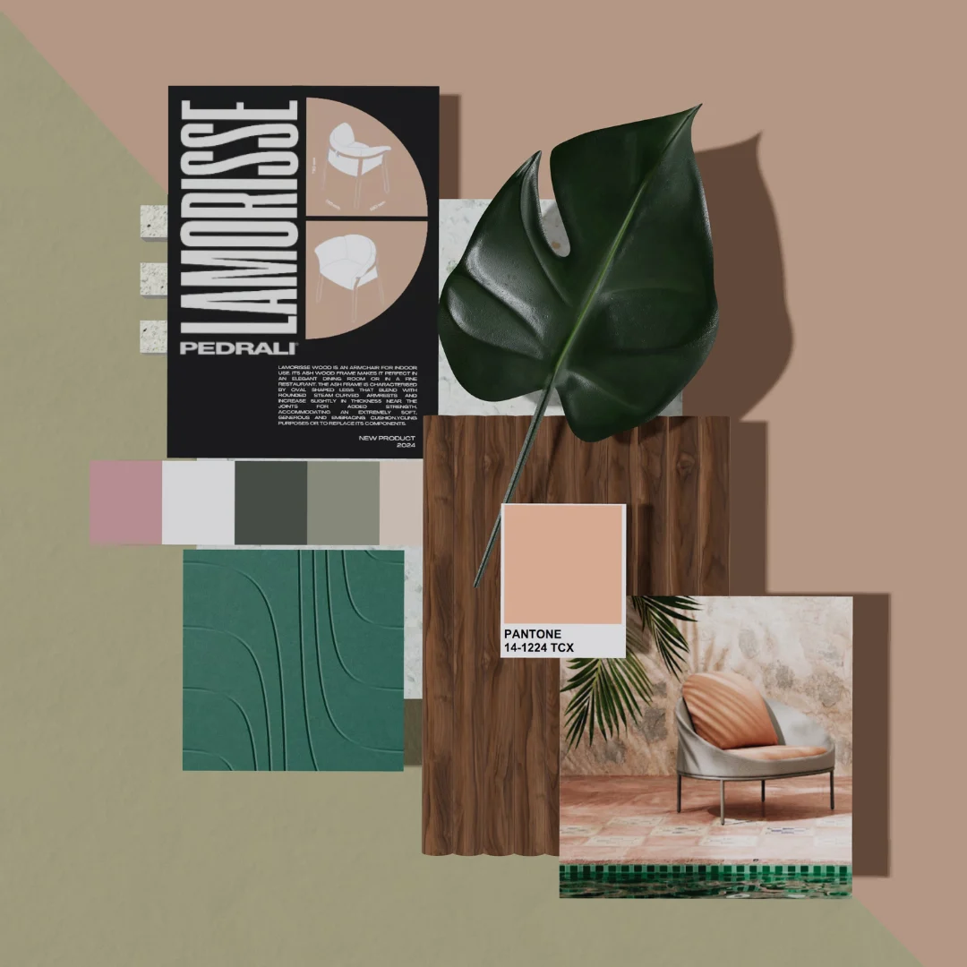
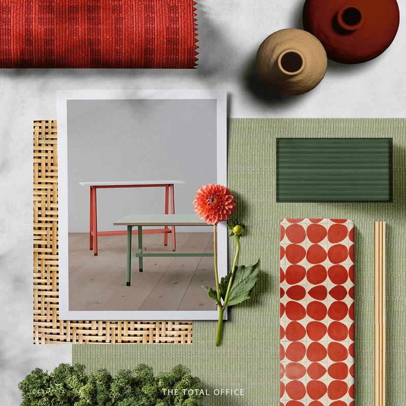
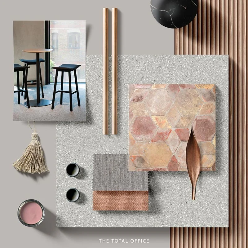
Coral Sands
Featuring Smile Plastics - Heron Green, Pedrali- Lamorisse and B&T- Dor
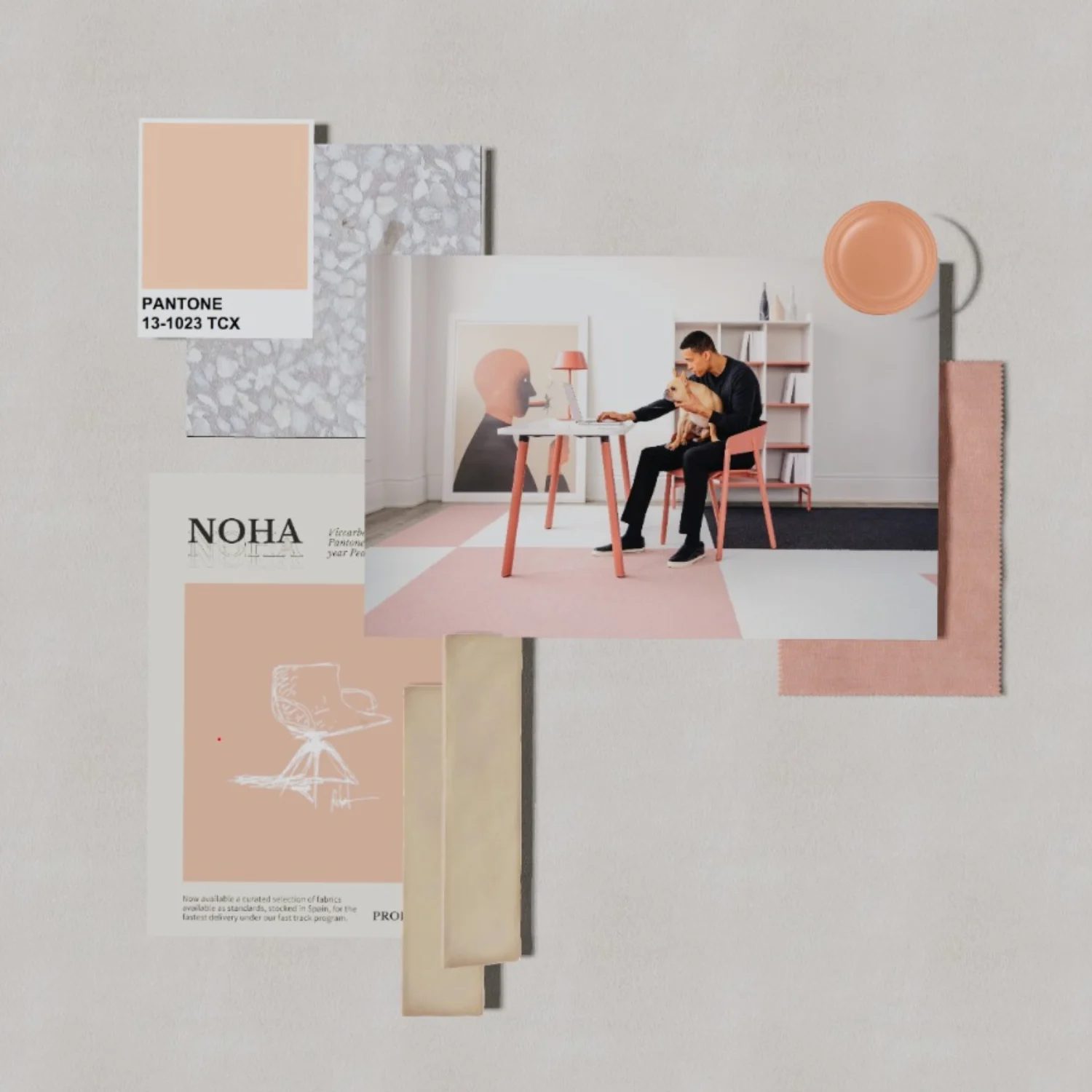
Peach Fuzz
~ Peach Fuzz ~ Keeping the trend with the Pantone color of the year (Peach), It's a mix of pink and orange, often a light and soft tone. As it's a warmer tone, it can help brighten your office space. Adding peach can help bring a summer glow to your space.
Sun & Sand
Chasing the Sun ! The palette is inspired by the beauty of Golden Hour in combination with gorgeous sunset shades making it a warm cozy palette with a touch of luxury for any interior space. Hot Chocolate in front of a campfire anyone?
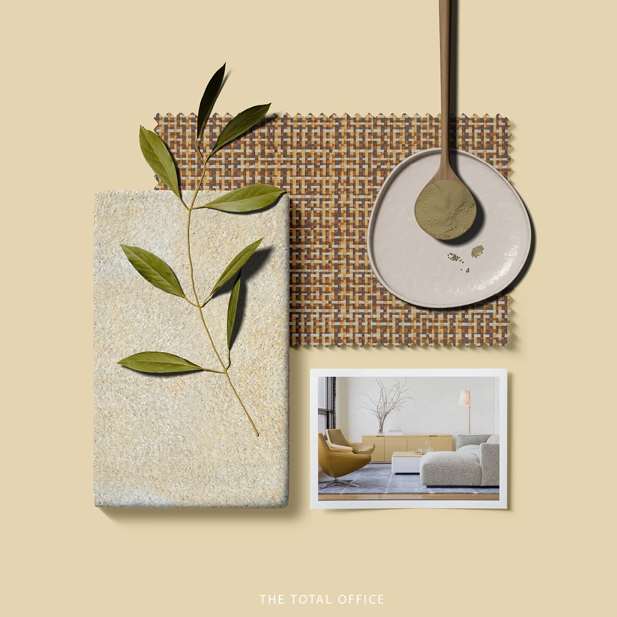
Moss Green
Moss Green color can help achieve a botanical or nature-inspired interior. Pairing it with almost any color, it can provide a fresh look which is great for any space such as collaborative areas, meeting rooms, or individual spaces.
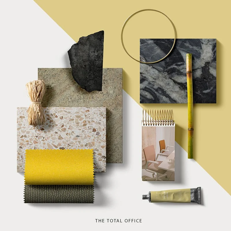
Positivity has a color, and that’s Yellow!
positivity has a color, and that’s Yellow! All we are doing here is to prove the beauty of every color, and encouraging the use of vibrant shades. We definitely enjoy our little combination for this week, what are your thoughts on it? ???? . . . #lovewhereyouwork #moodboard #materialboard #yellow #green
Lilly, the beauty!
This beautiful palette has been inspired from the different shades of purple and yellow found in the Lilly flower which is an interesting mixture found in a naturally made element. Purple, a vibrant color has been combined with a cheerful color such as yellow could be used for a focal point area to make the space more interesting to look at.
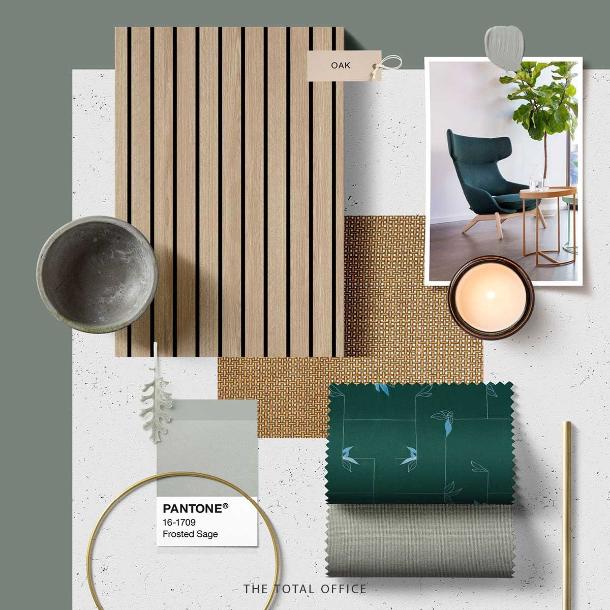
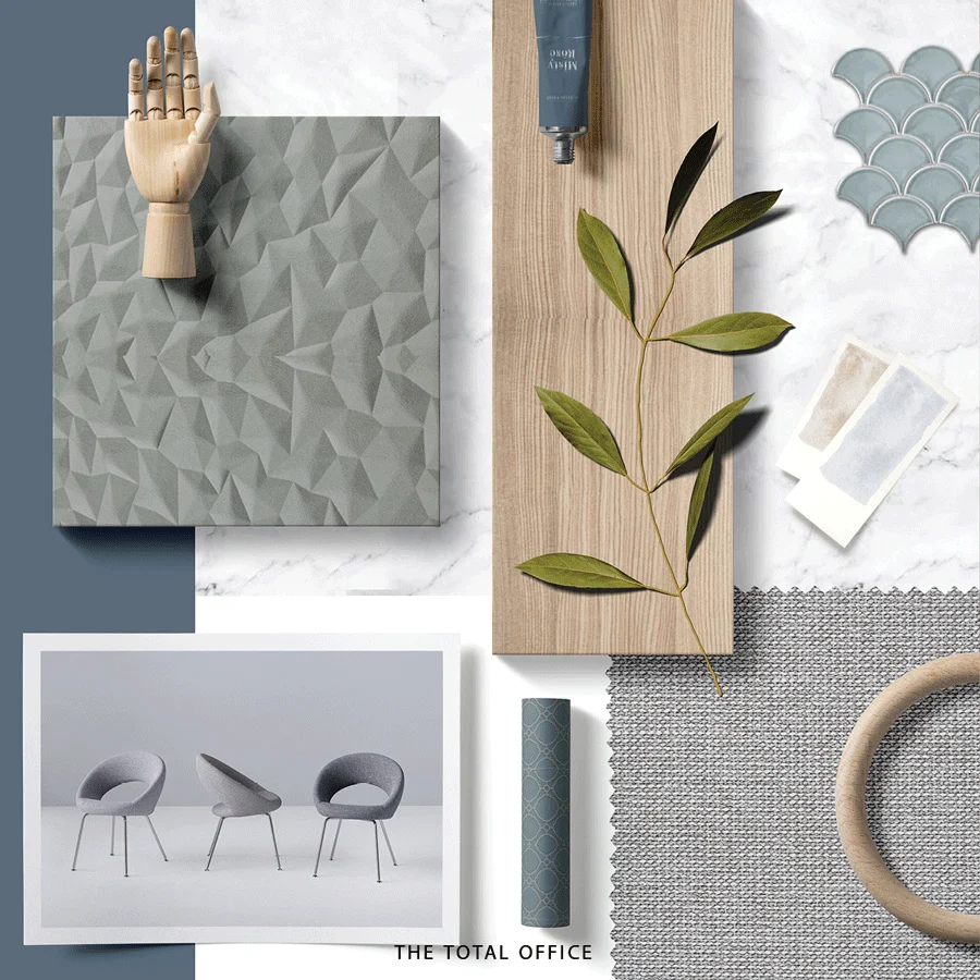
Sage, the freshest shade !
Known for its shade of Green, but the hint of gray makes it more of a subtle color. We love how this color stands out simply by adding some wooden elements to the theme. What would you mix this beautiful shade with
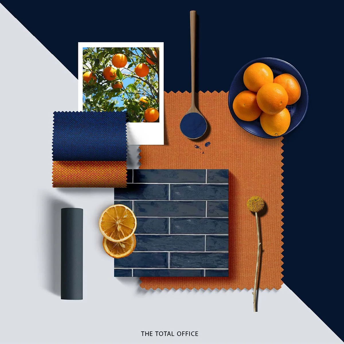
The Orange Tree !
A tree that symbolizes success, happiness and prosperity in many cultures; the source of inspiration for this moodboard combines with deep blue shades of the sky, creates a perfect resonance with nature! Enjoy the playfulness of this combination.
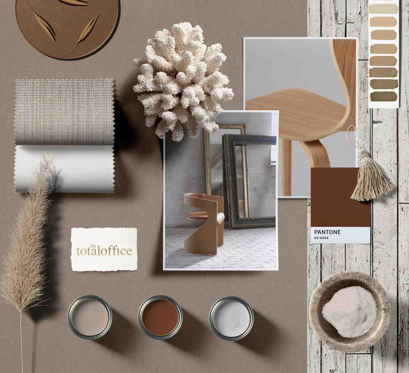
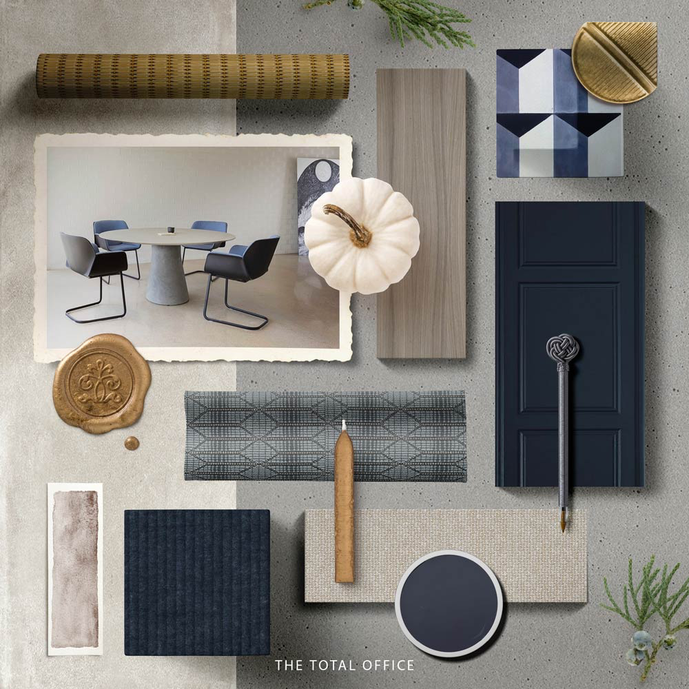
Calming Neutrals !
Neutral shades have always been known as the base color palette when it comes to minimal design; it encourages the use of patterns and colors more easily within a space without overwhelming the occupant. Are you for #TeamMinimal or #TeamMaximal ?
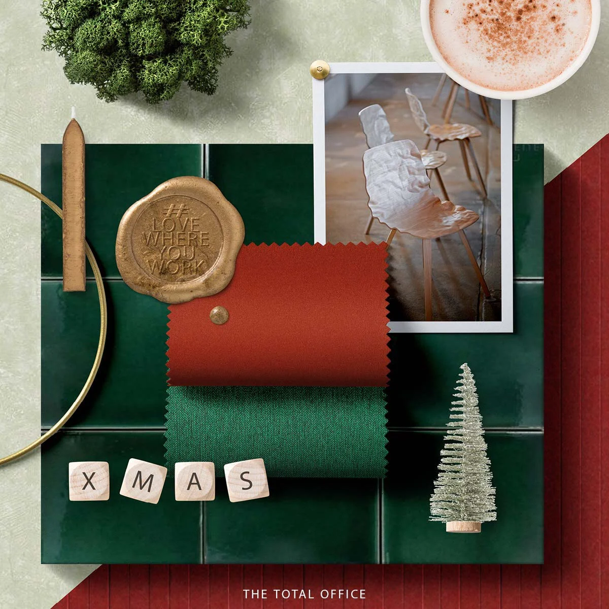
Feeling Festive !
It’s that time of the Year, all about winter nights and fairy lights! We are feeling our festive themed Moodboard
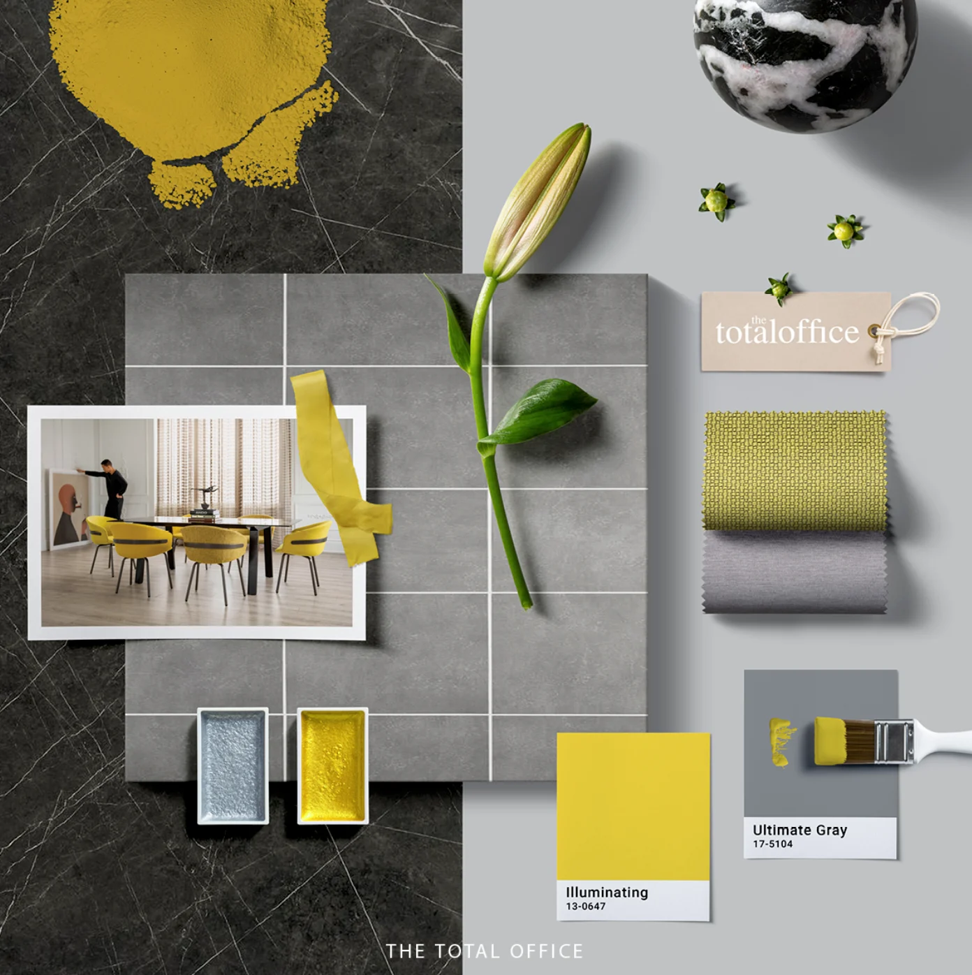
Brightening Up 2021 !
This is the second time Pantone decides for a dual color palette, and they have just announced the engagement of Ultimate Gray to Illuminating Yellow. What are your thoughts on this mixture?
Chasing the Sun !
Chasing the Sun ! The palette is inspired by the beauty of Golden Hour in combination with gorgeous sunset shades making it a warm cozy palette with a touch of luxury for any interior space. Hot Chocolate in front of a campfire anyone?
The Grey Area !
The Grey Area ! In-between pristine white and powerful black lies the sophisticated Gray. This week's mood board is all about Grey and its tints.
The Pink Cloud !
The Pink Cloud ! This Week Monday Mood-Board is representing the unique and authentic Aegean blue in combination with a touch of blush pink seeking a bold, but at the same time a softer color palette. Start considering pink as one of the colors to be used more often, It’s worth it !
The Orange Blossom !
The Orange Blossom ! This week Monday Mood-board is putting some energetic orange shades against warmer tone green palette, radiating goodness and peace. If you are looking for a color to brighten up your space softly, then orange is definitely the color you are missing !
Let The Sparks Fly !
Let The Sparks Fly ! This Monday mood-board will help you to create a clear clean look within your space. Considering blue as a primary color, there will be a wide range of color palettes to go with this particular shade; but, for Today, we decided to keep our beautiful Naval blue the focus of our mood-board by mixing it with some neutrals, and obviously a tint of gold to make it glow all the way !
The Beauty of Olea !
The Beauty of Olea ! Today, our Monday Moodboard is inspired from Olea, the symbol of wisdom, health and luck. Nature, itself is the master of color combination. The green, and brown shades found in this beloved tree is naturally a spectacular palette to be used.
From Pink Salt to Pink Sand !
From Pink Salt to Pink Sand ! This week’s Monday Moodboard will take you to a beachy vacation in Elafonisi. Can you smell the salt in the air? The contrast of a vibrant blue and a blush pink is fresh and brings a summers warmth to a space.
READ-Y to Dare ?
READ-Y to Dare ? Red is a classic color which is rooted in human history symbolizing wealth and sophistication. By this week’s Monday mood-board, we are hoping to encourage you being brave enough to start using shades of red boldly in your space to highlight the areas that need to stand out more.
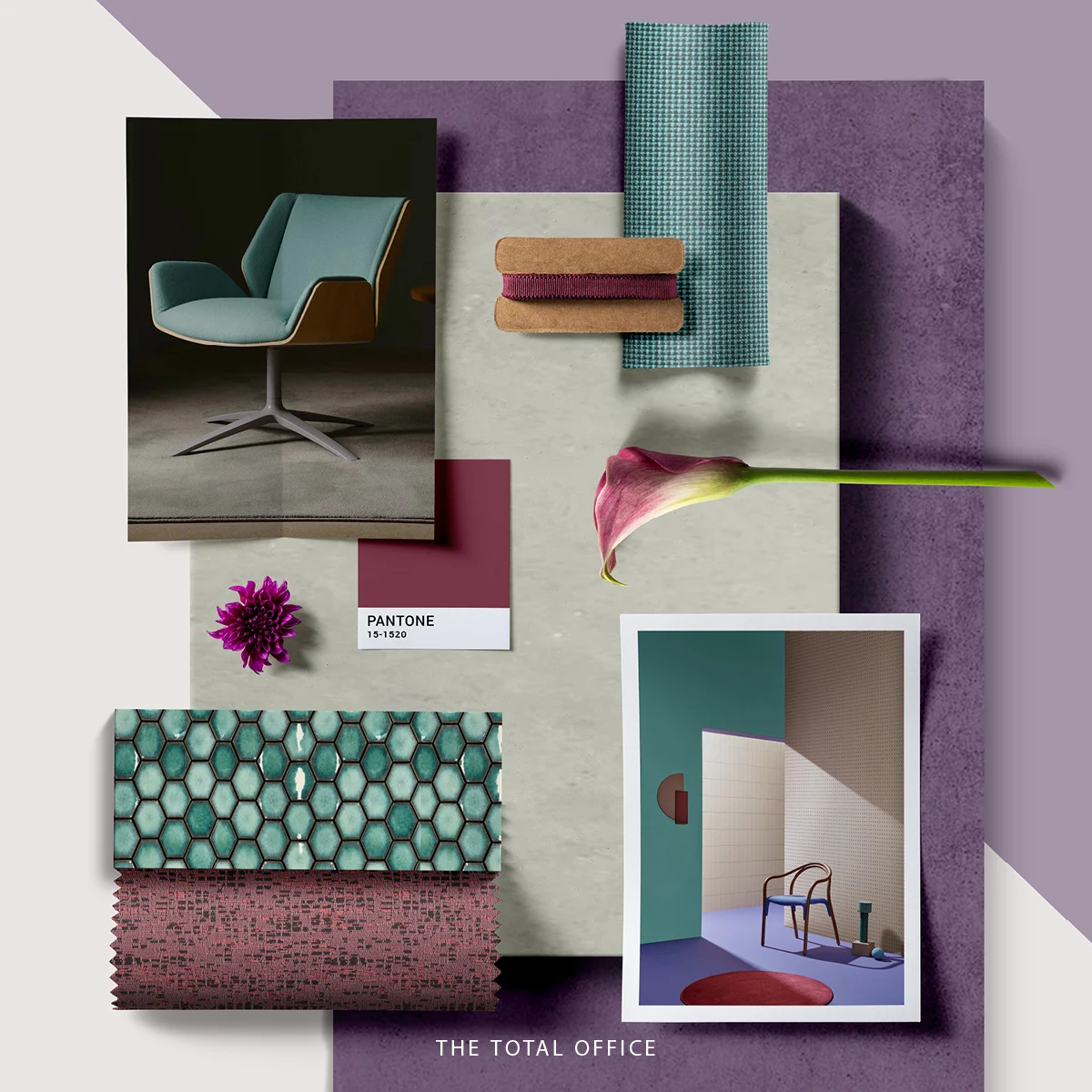
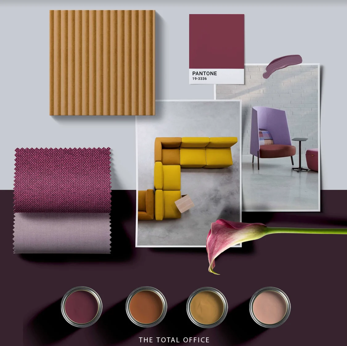
Purple, The Space Thief !
Purple, The Space Thief ! This week’s Monday mood-board is all about the richness, royalty, and the elegance of the purple color. We would like to call her the thief of the space, cause once present in an interior, she would make everything about herself by grabbing all the attention towards her stunning shades.
Road to October !
This week’s Monday Moodboard is savoring the season, and we are celebrating it by sharing some Autumn aesthetics we put together. Getting closer to October made us whip up a Pumpkin Spice Latte, ready to enjoy the moment!
Step Aside, Mellow Yellow !
Today's mood board feels like a sunny day. The playful goldenrod yellow combined with muted gray is a reflection of the sun and the earth. Let's bring the outside, in !
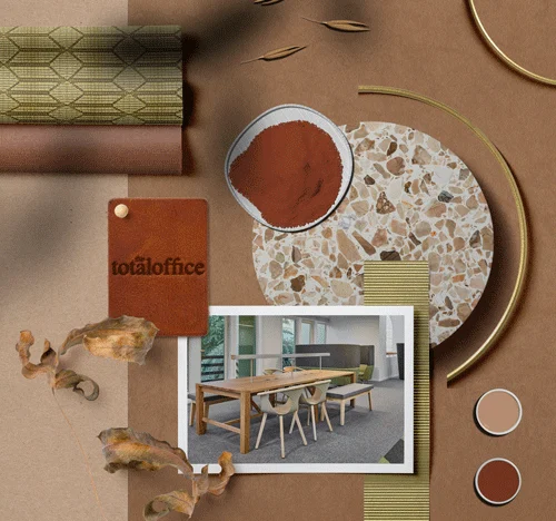
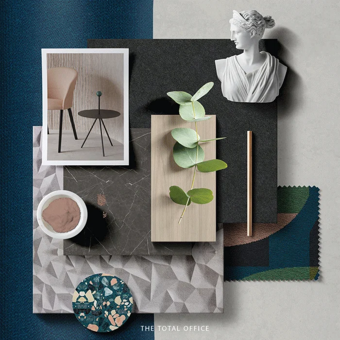
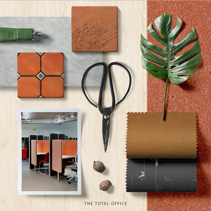
Go Green !
This week, our Monday Mood-Board is focusing on nature and its intrinsic value; how we as designers can have a great impact on the wastage. The use of recycled glass and plastic in Terrazzo , or just a simple foundation of clay for Terracotta can make a perfect alternative for eco-friendly materials.
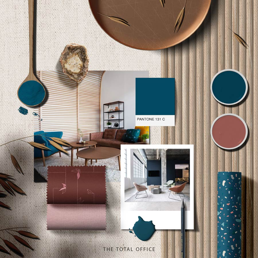
Not Your Monday Blues !
Not your Monday Blues ! This week’s Monday Moodboard is here to fix all your Monday blues ! The color scheme is a combination of blush pink with a touch of bronze, representing a sense of restraint yet vivacity.
Ocean Lava !
~ Ocean Lava ~ This week’s Moodboard is inspired by one of the color combinations in nature, Blues, and Oranges. The mixture of the intense red and the orange’s freshness can be seen during sunrises and sunsets, while the jewel-like blue shades could be seen on the Mediterranean coast. #MondayMoods